
Anmara
Anmara is a premium artisanal brand of pasta in India which imports pasta made using traditional Italian processes from a small town in Italy.
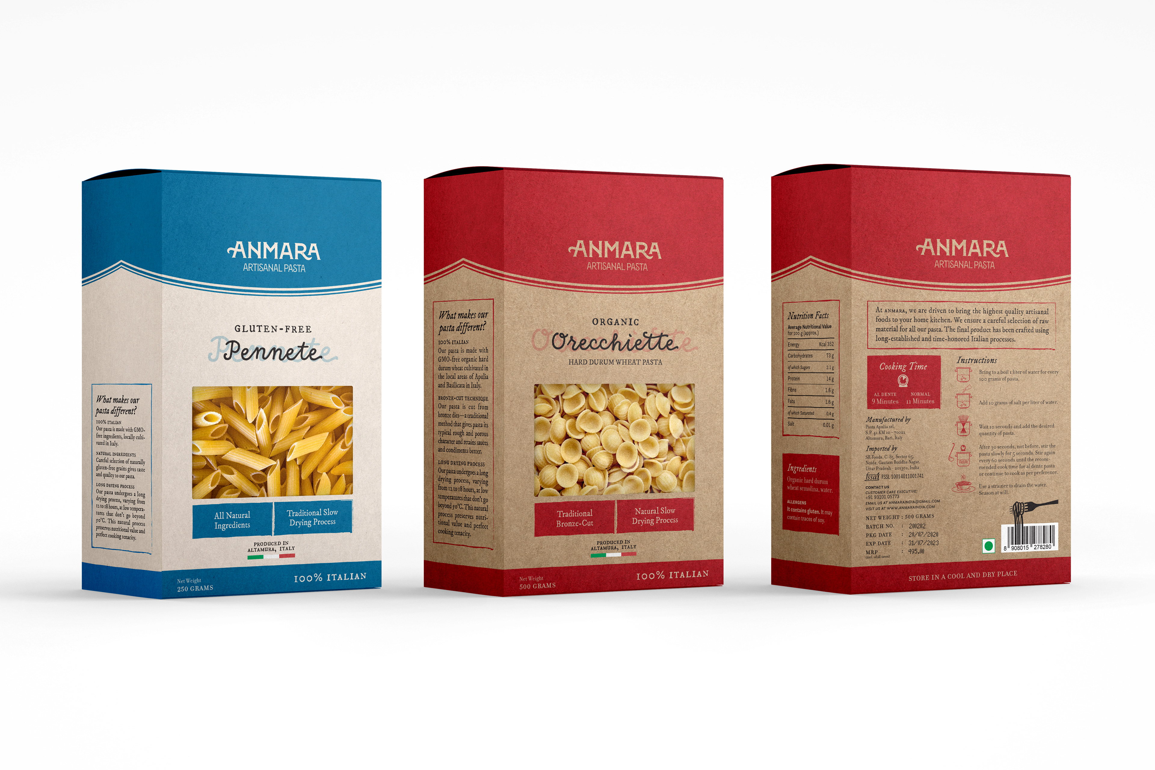
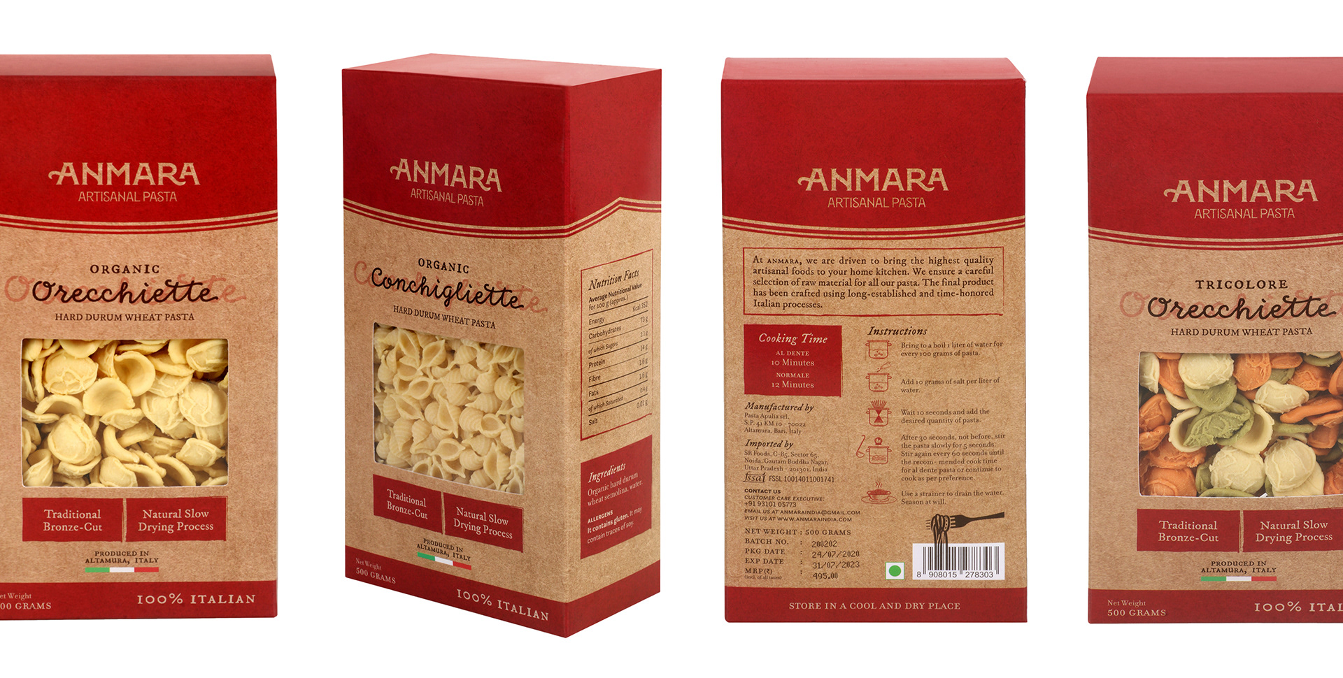
I created the logo and packaging design for varying sizes (for a total of 14 different types of pasta) including the gluten-free range. I worked with my brother (who is experienced in print and production) to realize the project.
Packaging Design
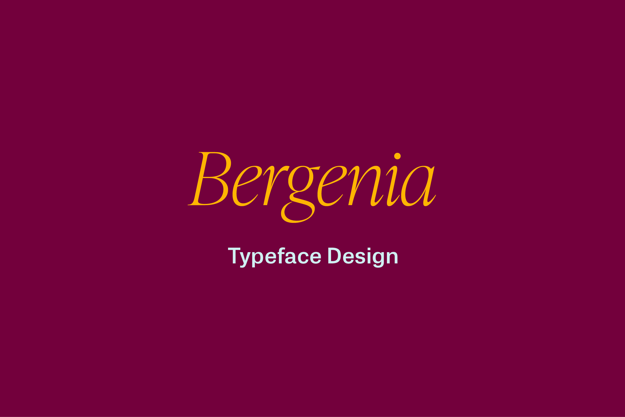
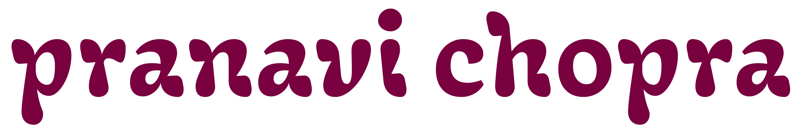
The Logo Design
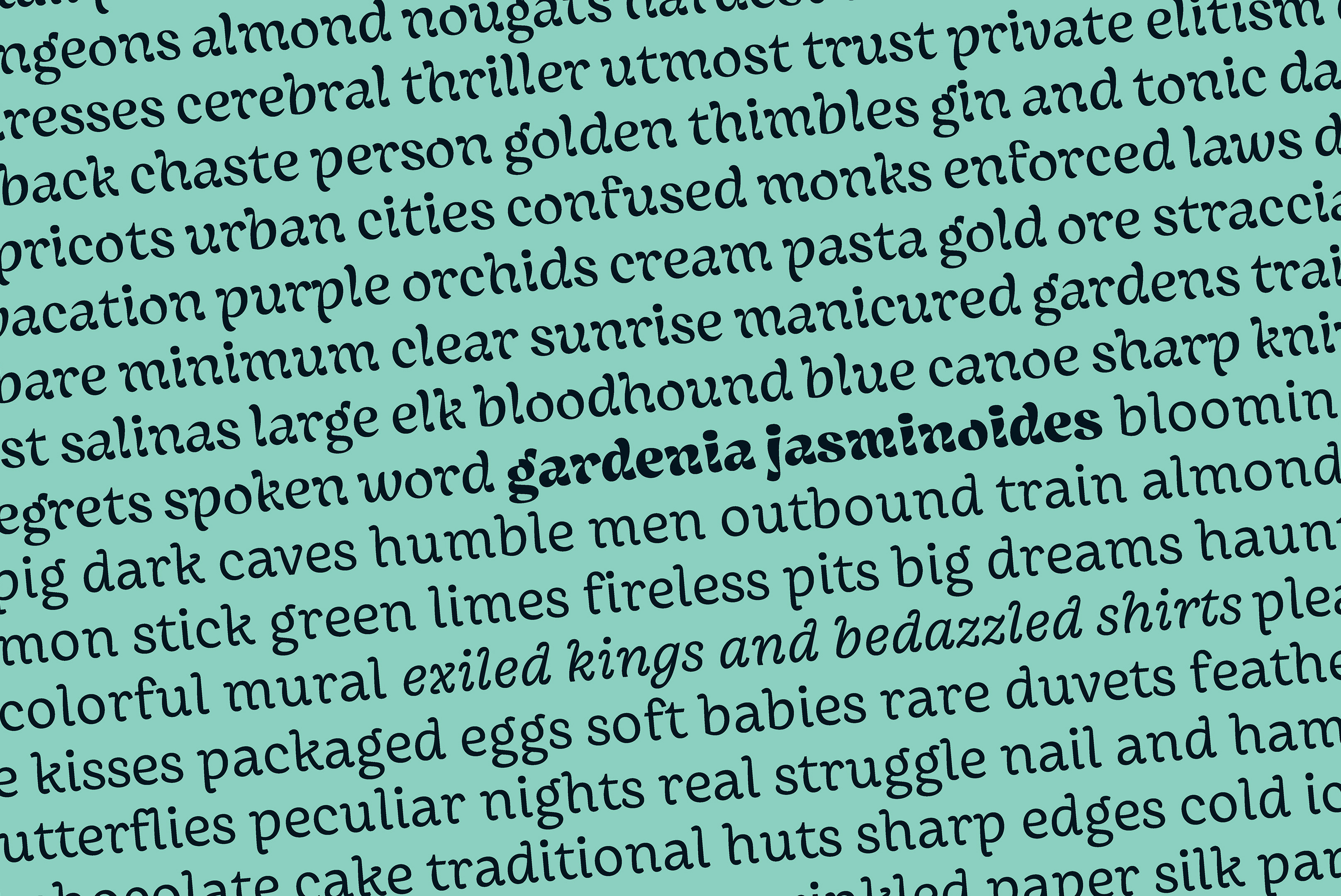
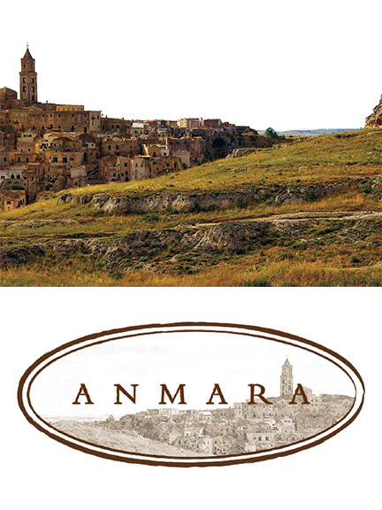
I created custom wordmarks inspired by our research on Italian typography. The concepts were based on a vintage Italian packaging for Amarelli (a classic Italian candy company) and Louise Fili’s style of lettering. I also explored a traditional look by using an image of the town where the pasta is made.
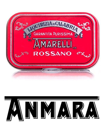
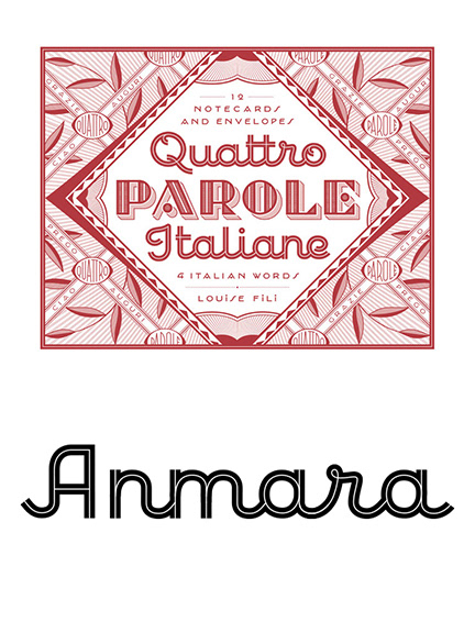
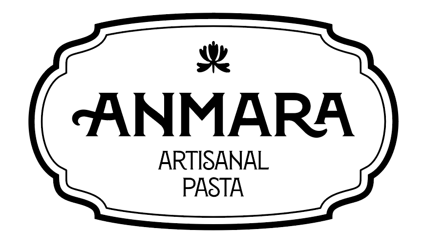
Eventually, we ended up going with the wordmark type set in Montecatini, a beautiful typeface designed by Louise Fili. It captured the nostalgia of 1930s Italian typography with an air of refined modern elegance.
An initial draft of the logo design
The Packaging Design
Concept 1
Bold Rustic
Bold Rustic
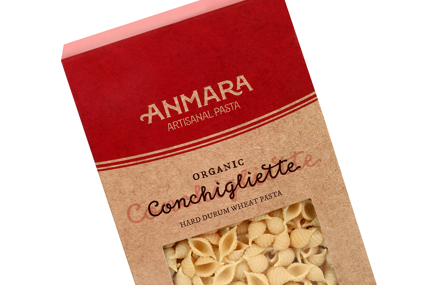
The first concept was a clean and traditional design on a brown paper bag to emulate how one may buy pasta locally in Italy. A single, bold color was used for visual appeal and to direct the information hierarchy.
A custom window for the pasta that adhered to a sketch of Altamura renders a one-of-a-kind quality to the design.
Concept 2
Watercolor
Watercolor
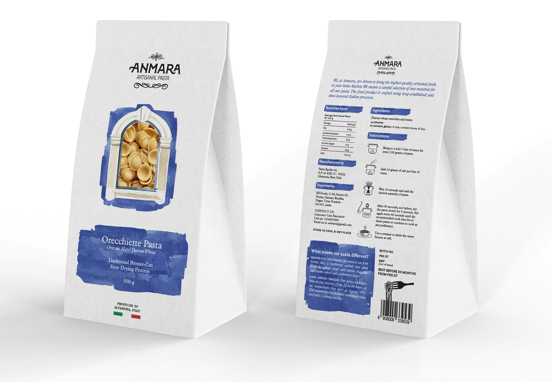
The second concept made use of a watercolor texture to communicate a handcrafted feel to the package alongside a custom window shape—a literal painted Italian window—for the pasta to be seen through.
The soft blue watercolor effect against the stark white background and a sparsely-spaced layout delivers a sleek, modern look.
Concept 3
Italian Blue
Italian Blue
The third concept was a clean, contemporary look with a blue color, similar to Savoy blue (or “Italian Blue”), used as a highlight color against the stark white coffee bag. A custom window and an addition of a sticker with customized information for each pasta represented the pasta being made in small batches.
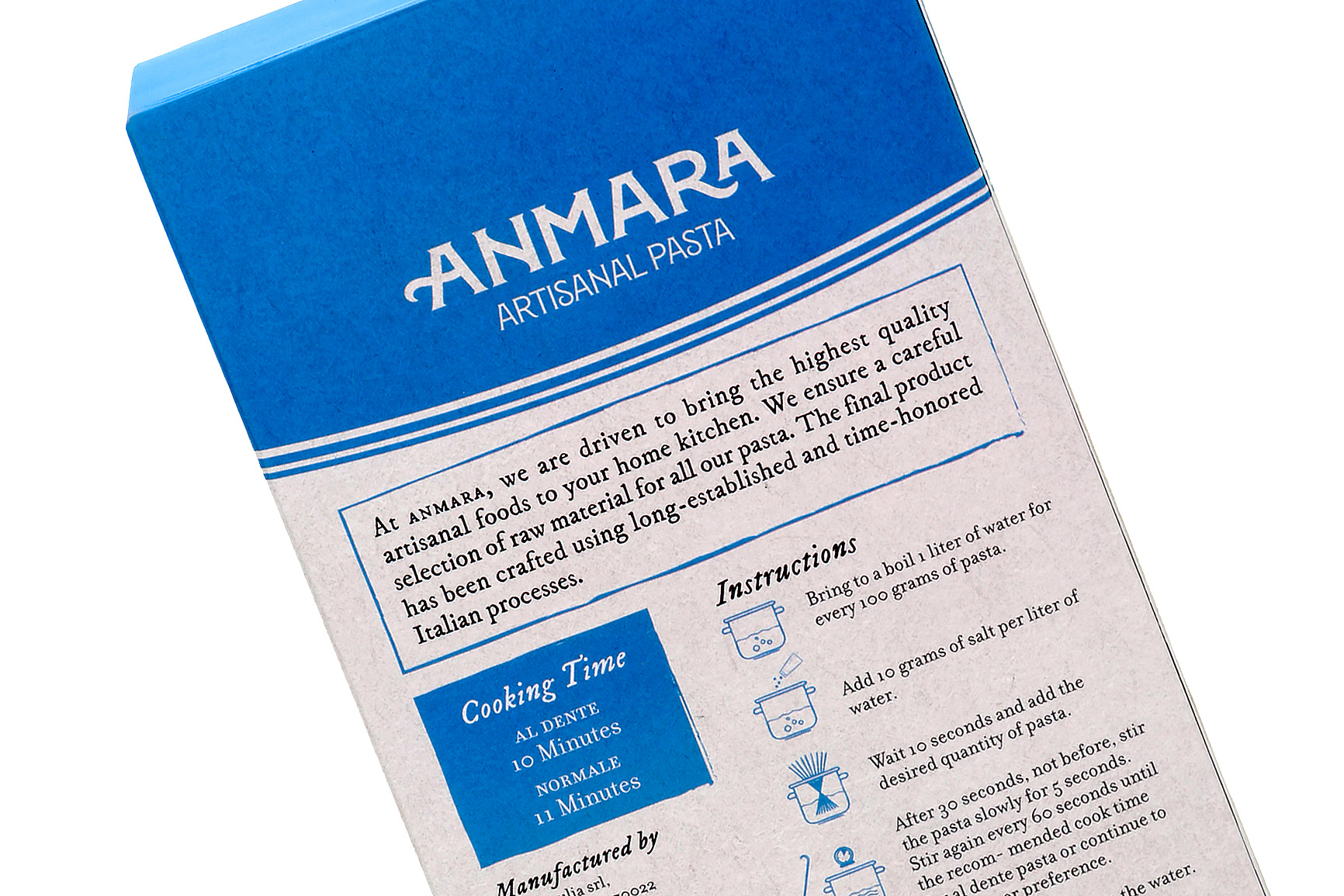
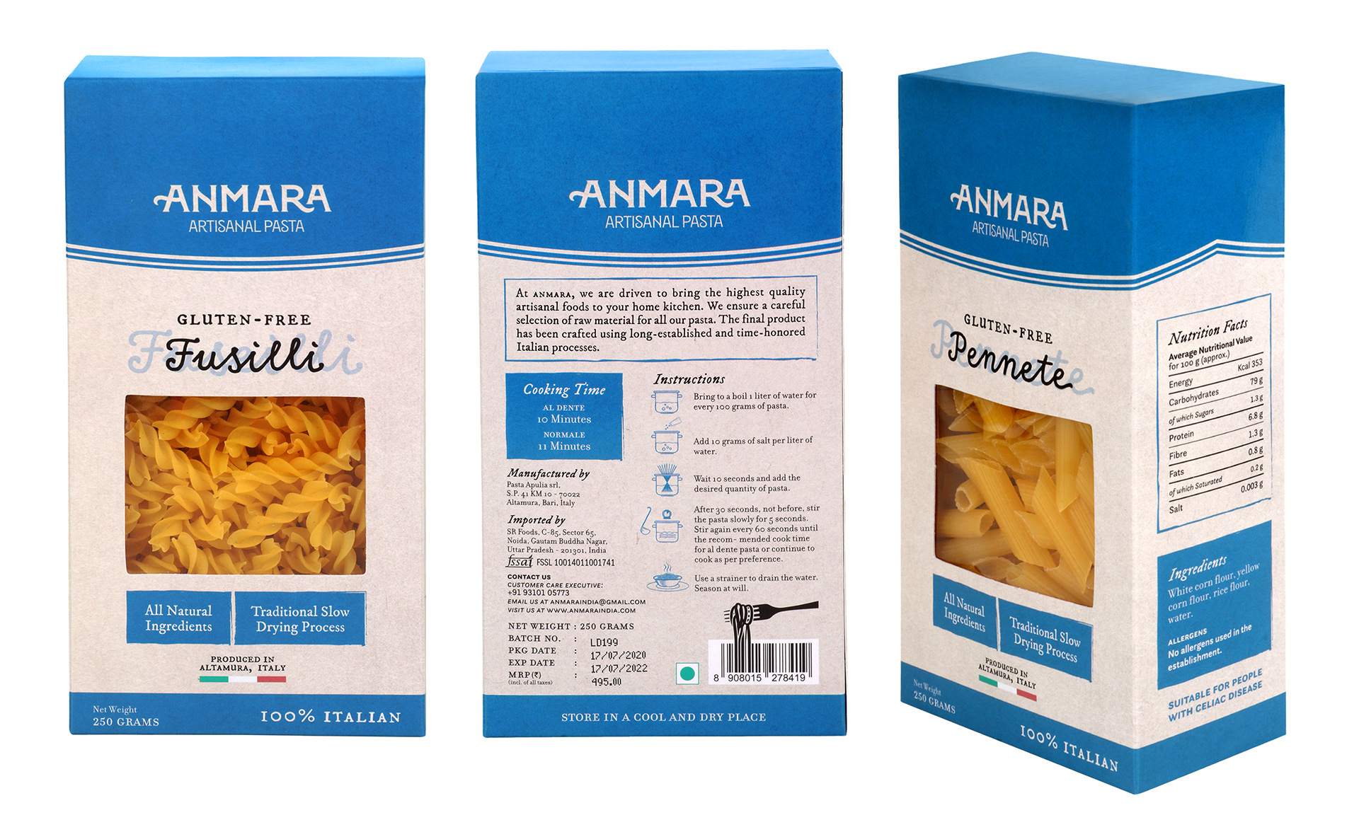
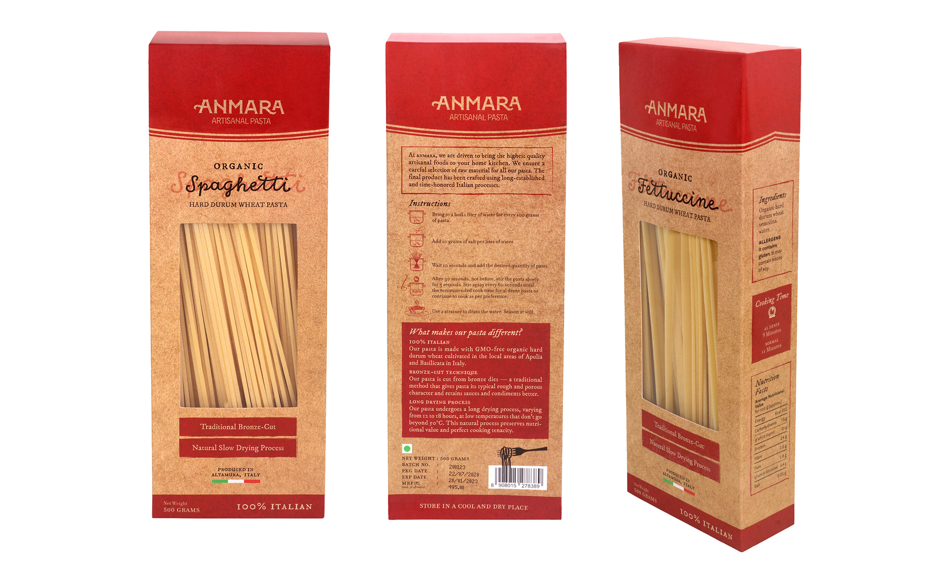
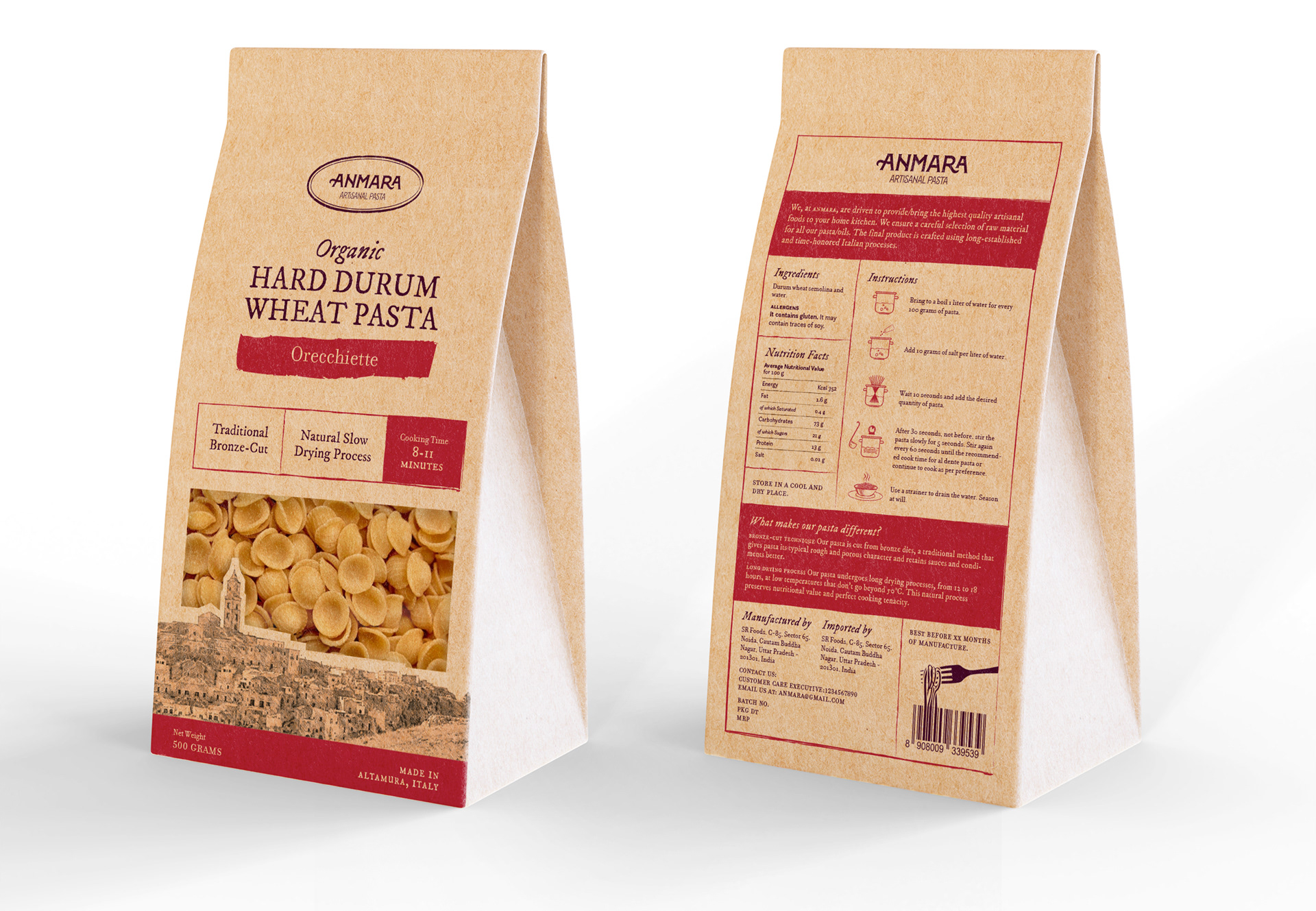
Final Execution
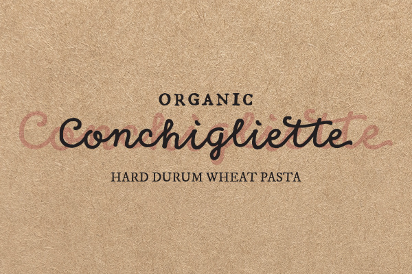
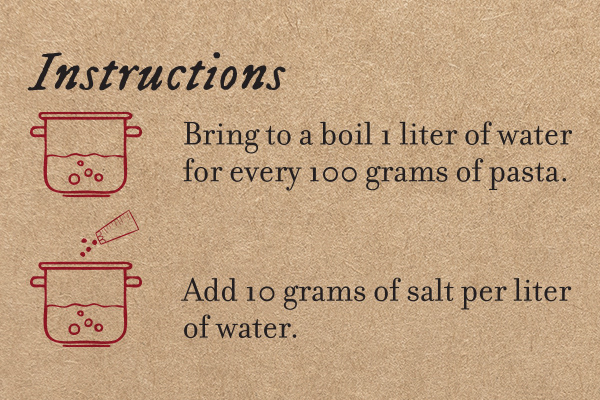
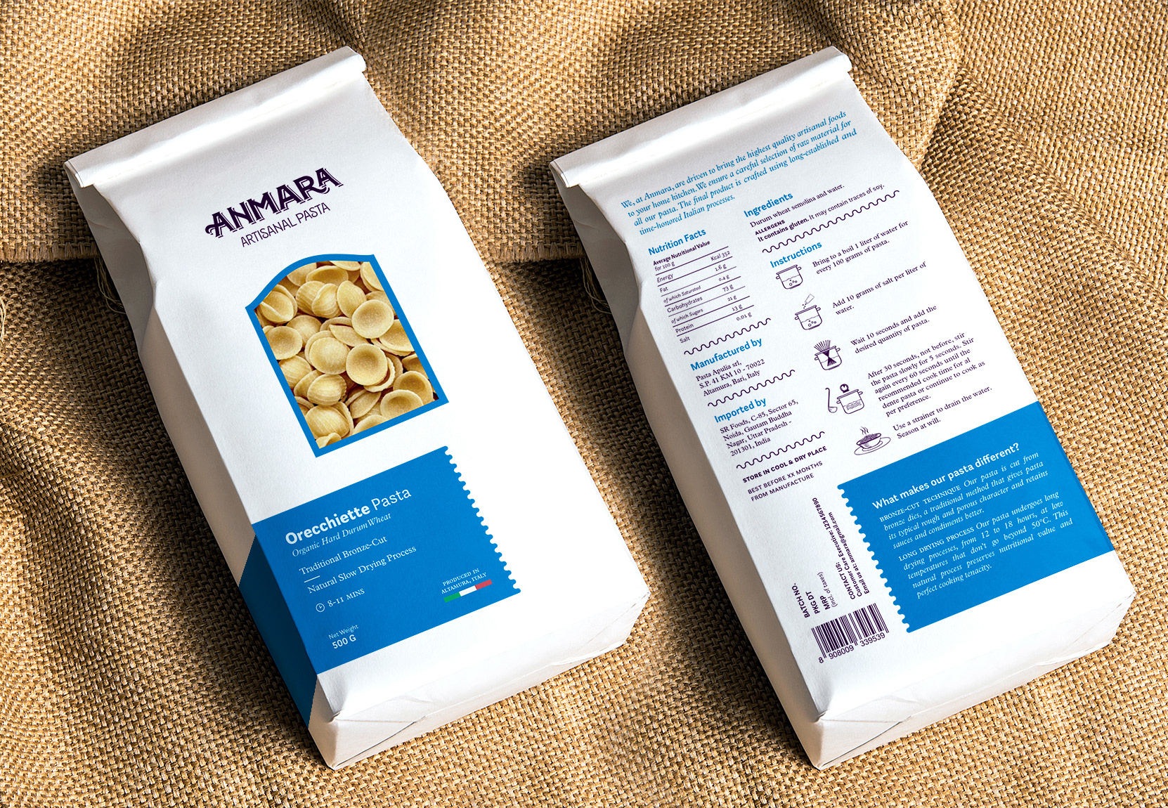
The final design was an iteration of the first concept with the use of a single bold color to communicate a quiet confidence. Neat type layouts convey care and a premium quality product.
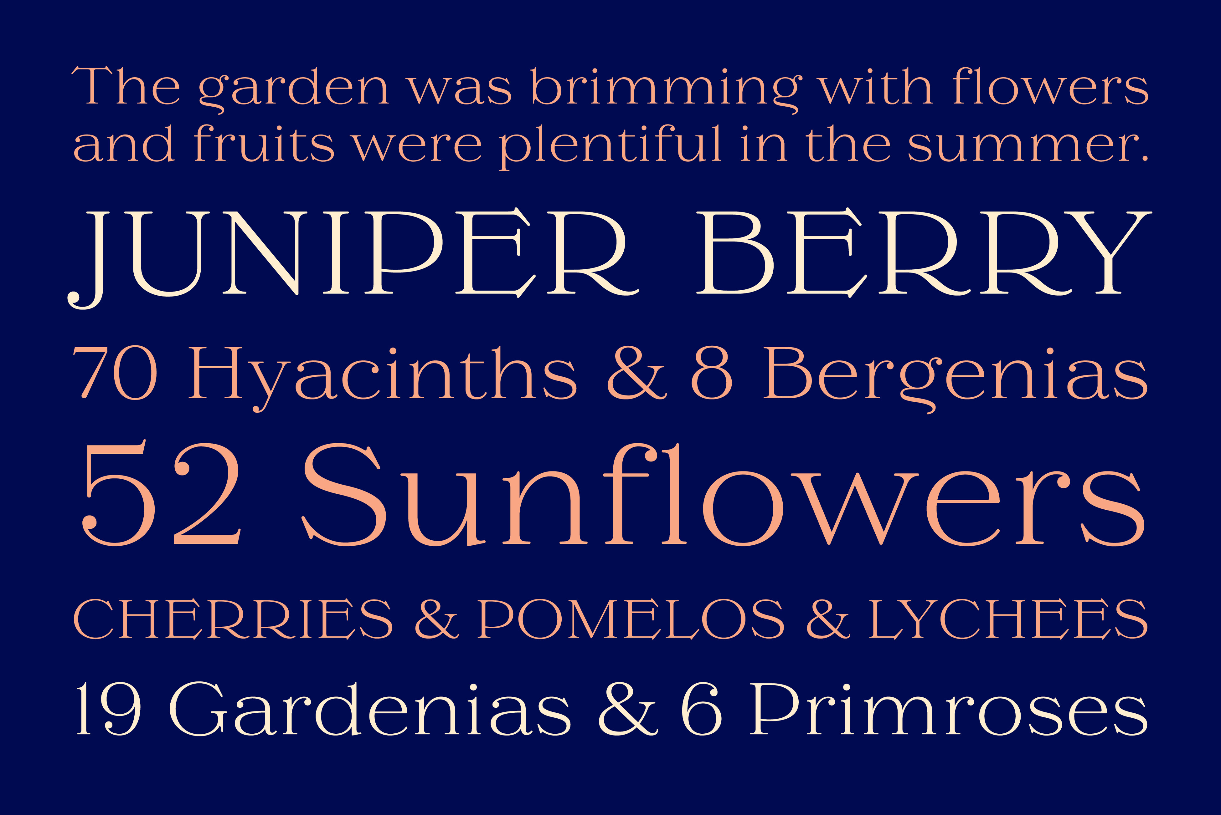
We let the typography communicate the handcrafted element of the packaging. I paired a classic Fell typeface from 1692 with the refined design of Filosofia, designed by Zuzana Licko, for a rustic yet elegant look. The addition of a script typeface reserved for the name of the pasta completes the artisanal characteristic of the packaging design.