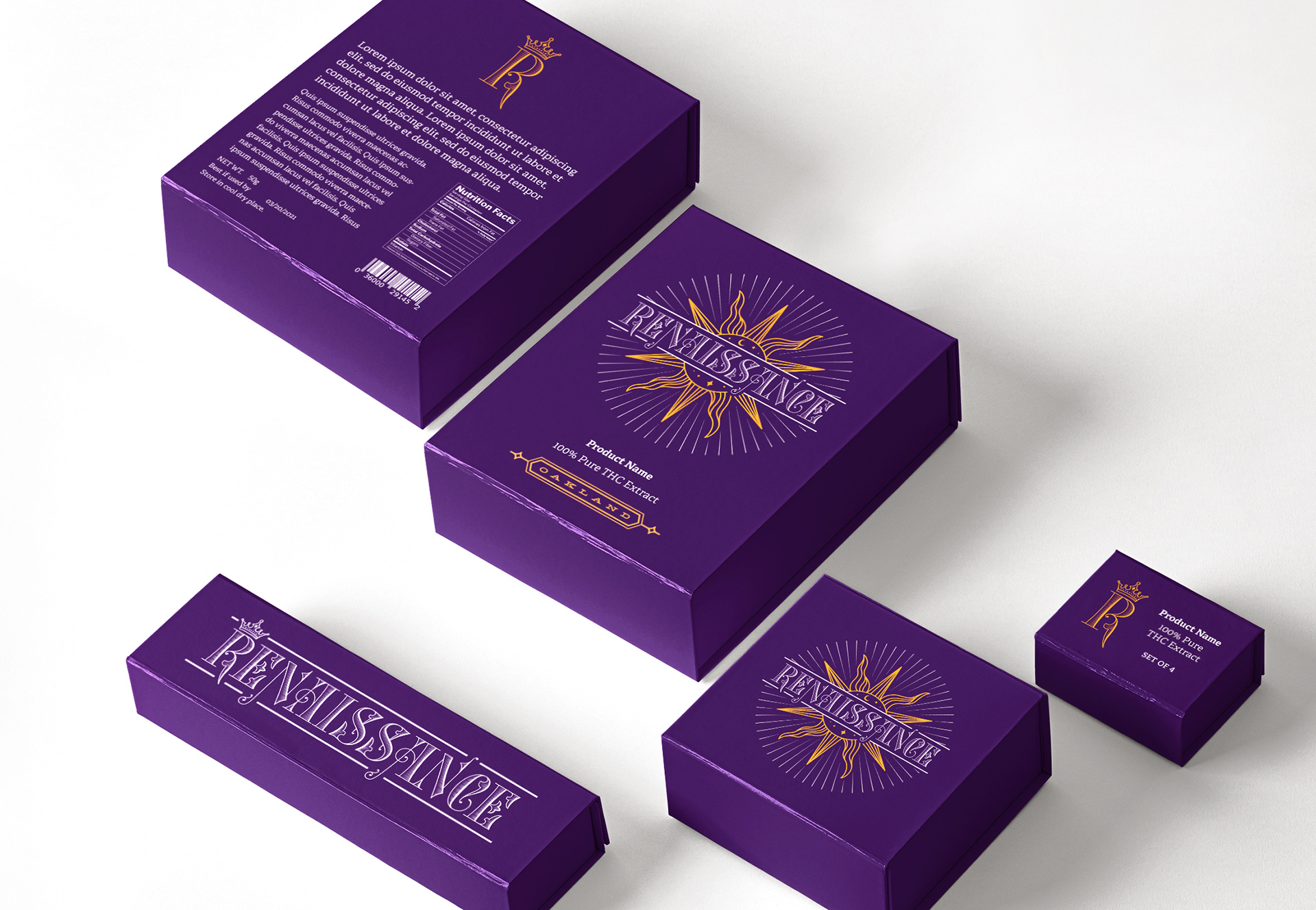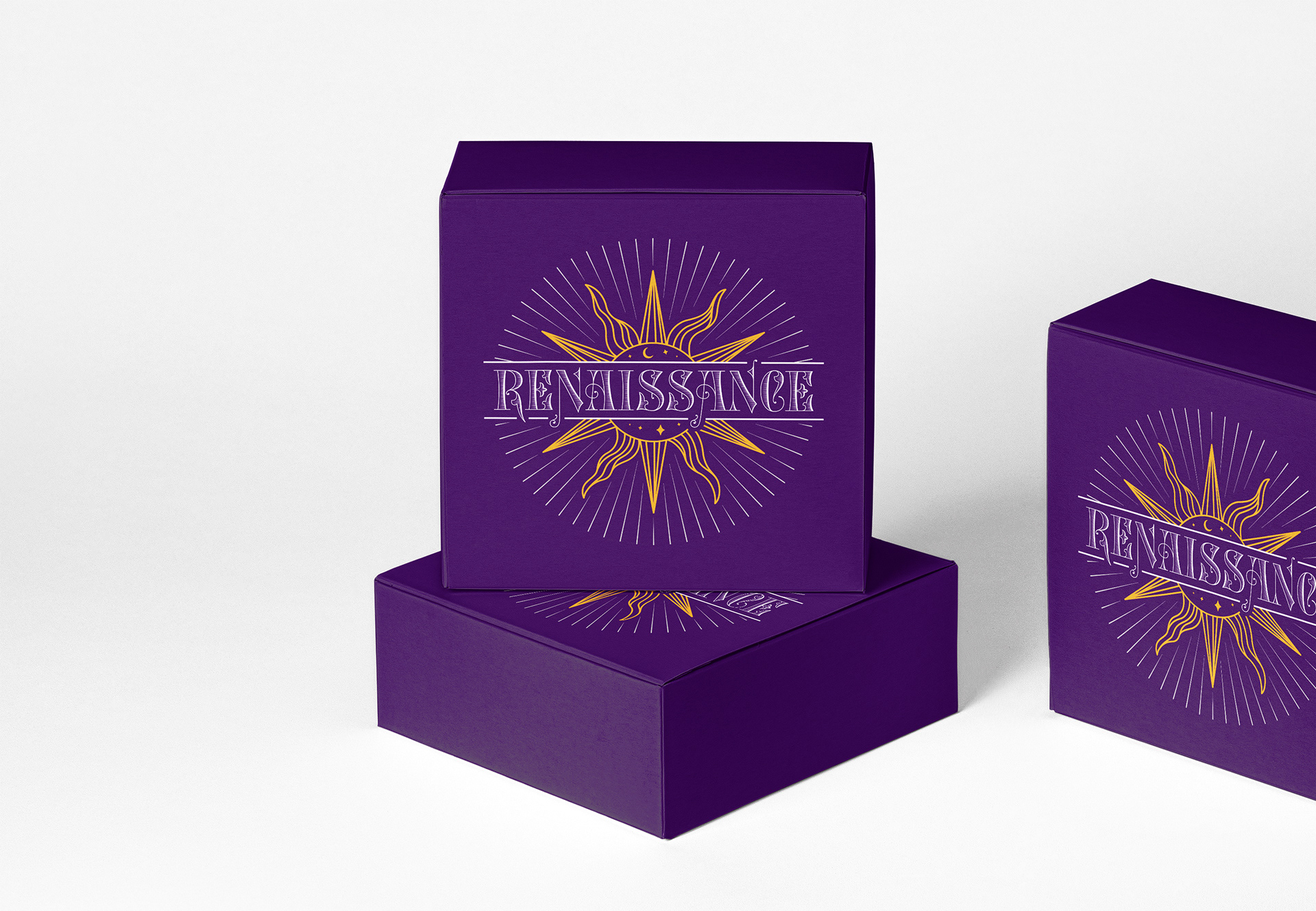

Renaissance
Renaissance is a brand of high-quality cannabis products made using 100% pure THC extract, based in Oakland, California. I was commissioned to create a logo and wordmark with the flexibility to use them across varied packaging needs.
Logo Design, Wordmark
The Process
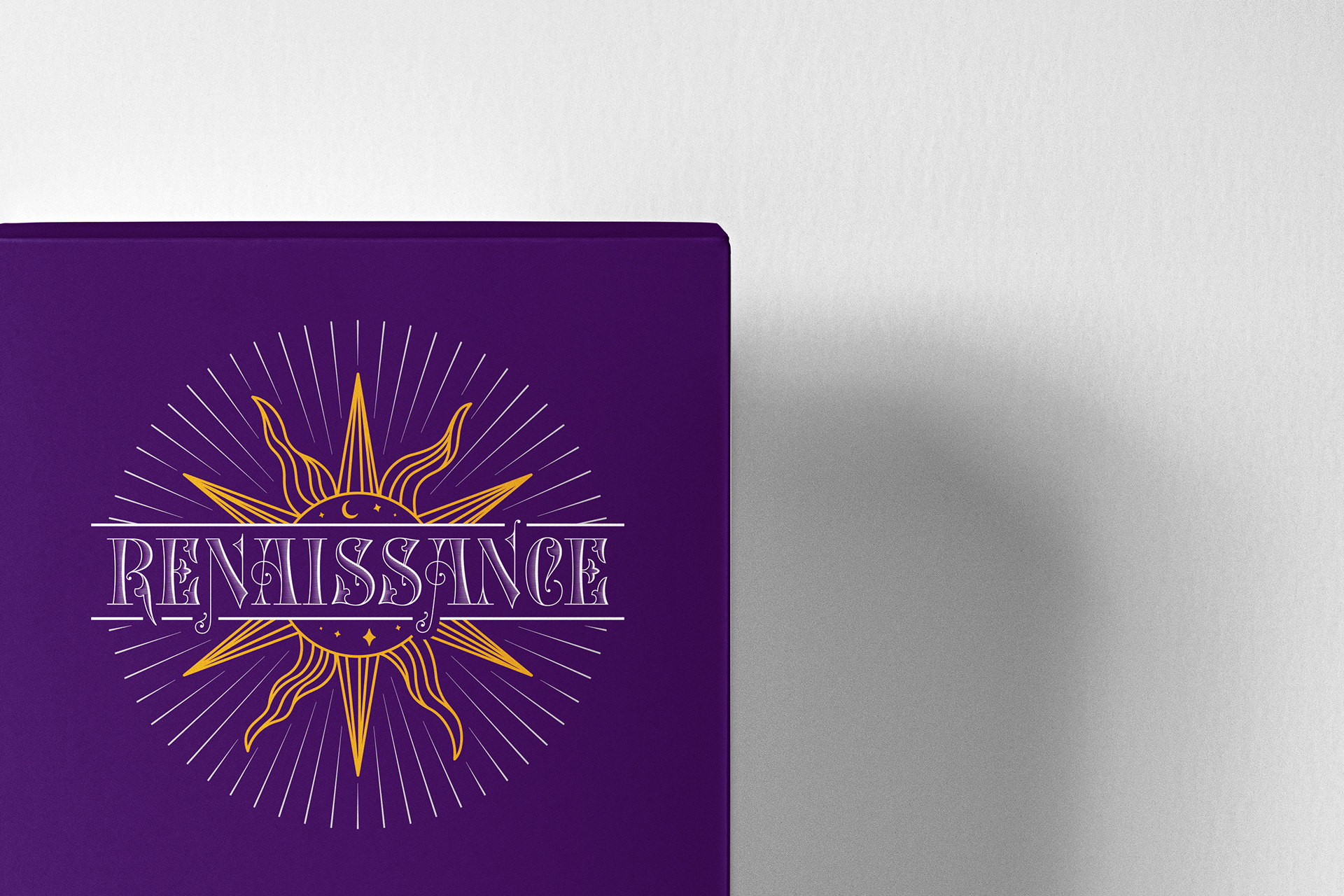
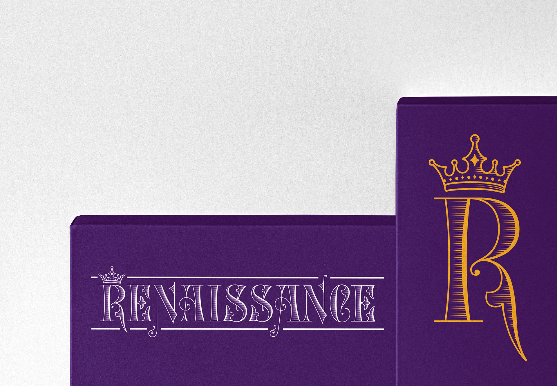
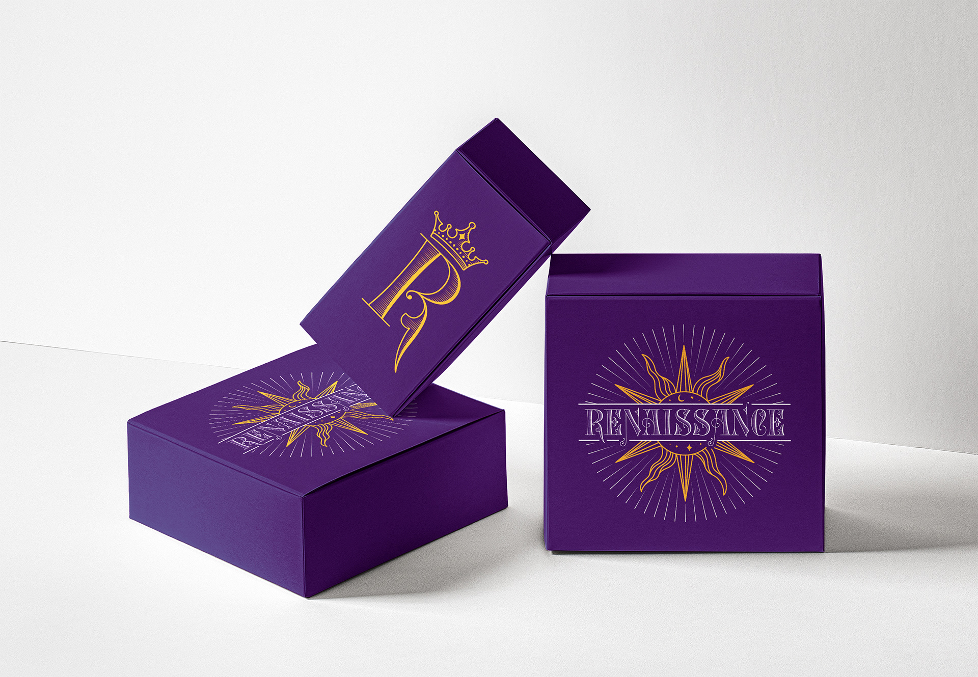
The client’s vision was a logo that exuded a classy, high-end and luxurious appearance symbolizing divinity and royalty.
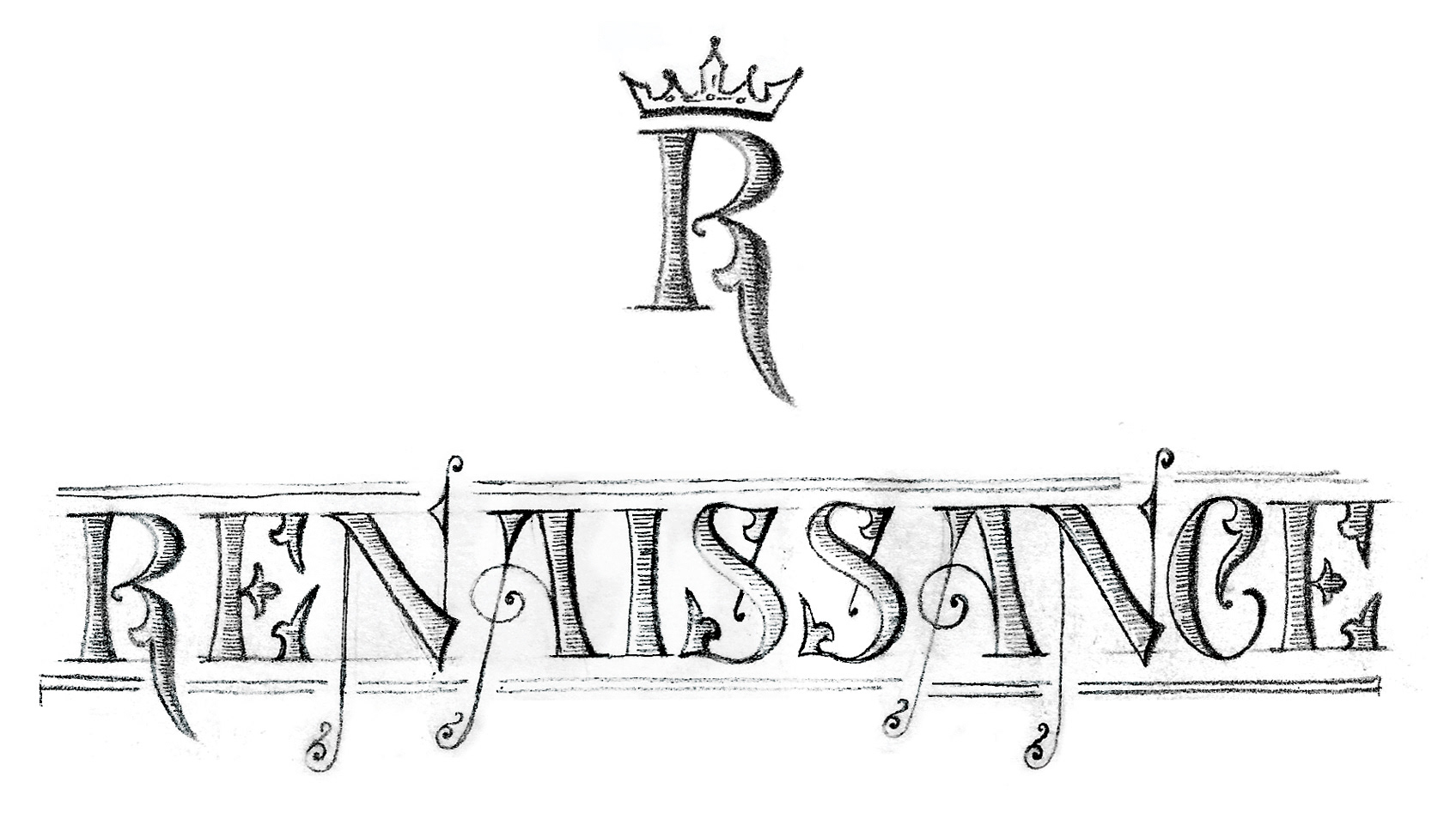
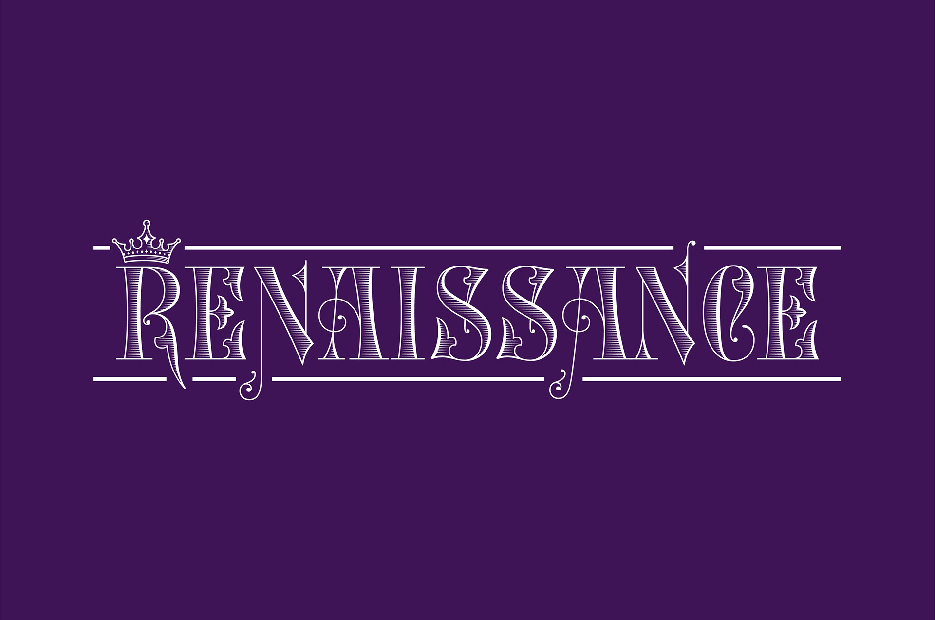
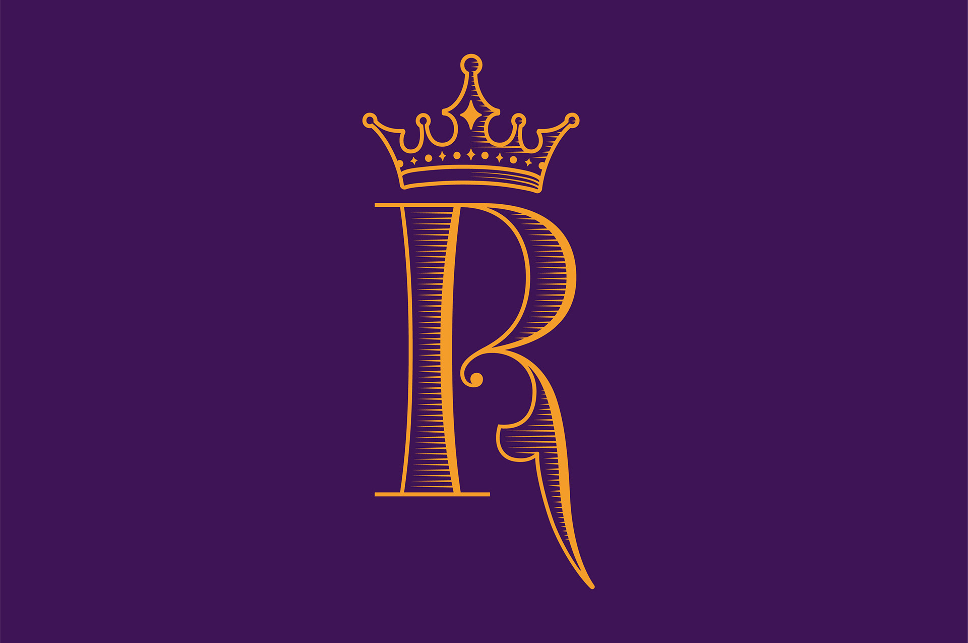
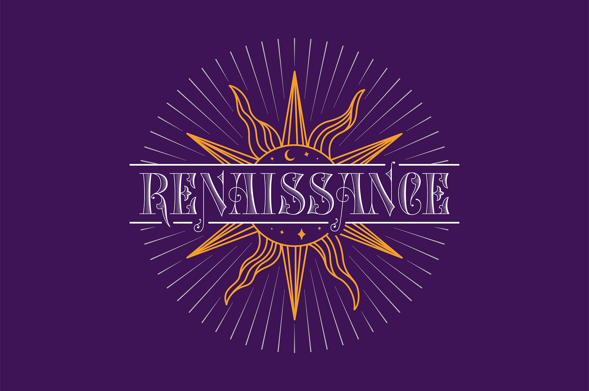
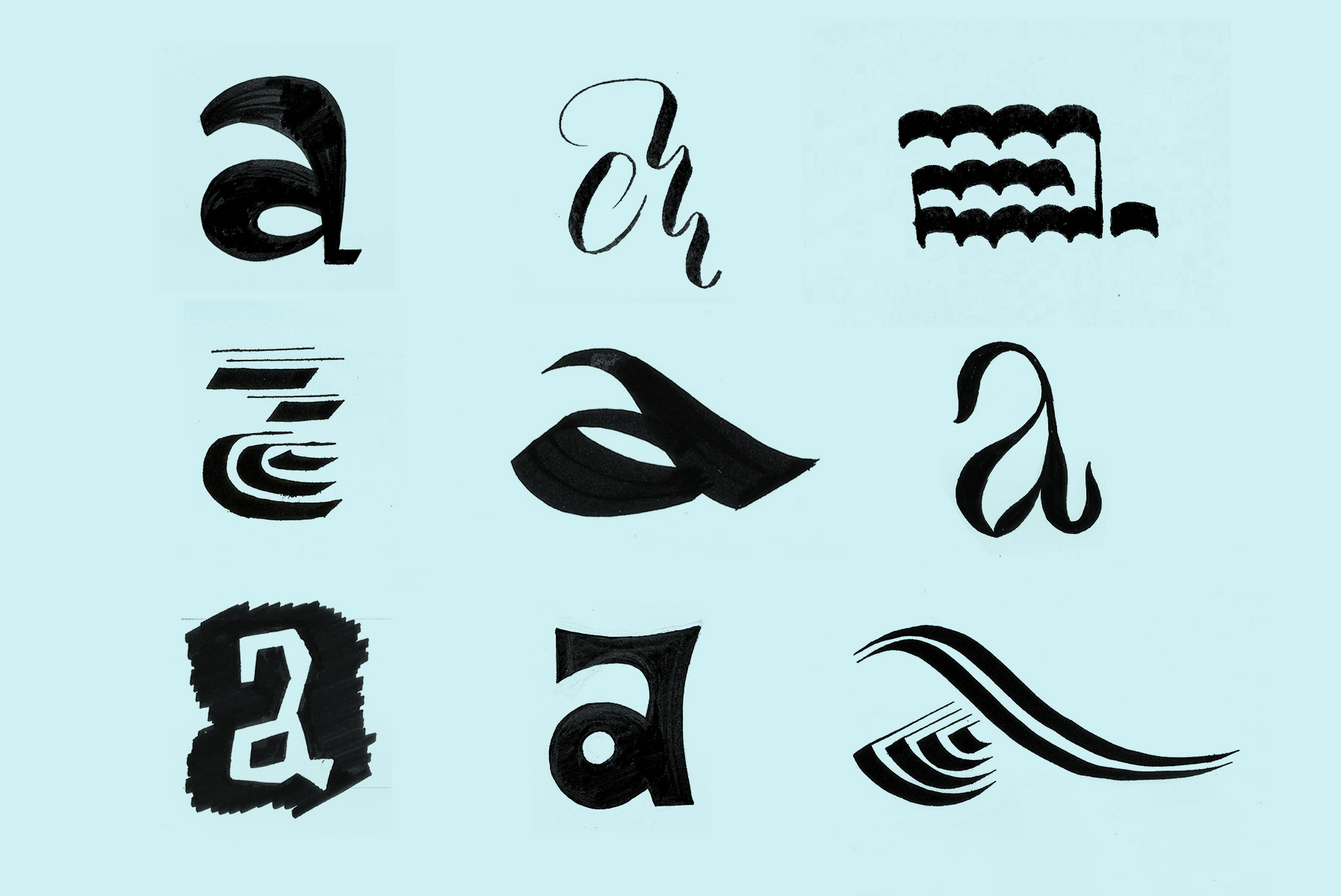
The wordmark is based on Victorian-style typography, the decorative letterforms representing luxury. The logo is made of a stylized sun behind the custom wordmark, adorned with stars, moon and light rays symbolizing divinity. An alternate logo utilizes the “R” with a crown symbolizing royalty. Together, they reflect a high-quality and niche product.
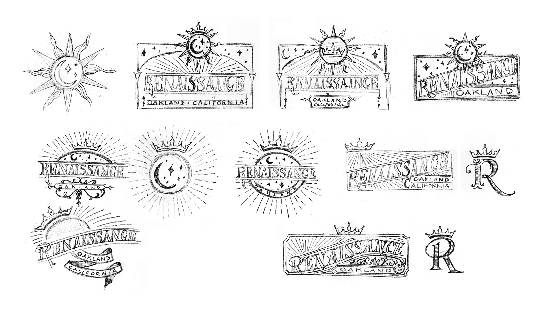
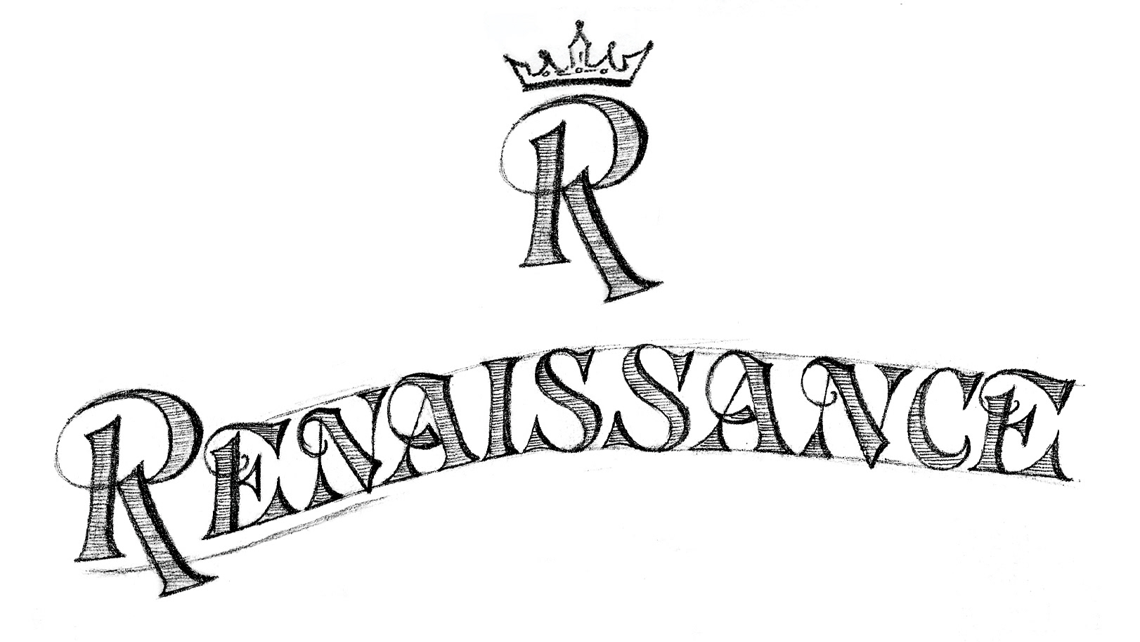
Concept 1
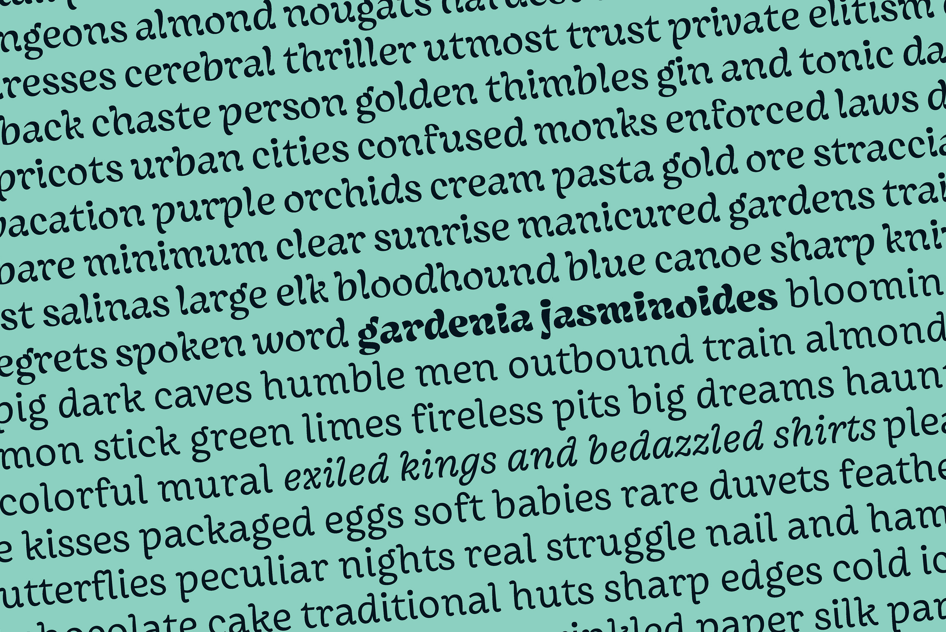
The first concept was based on the typeface called “Raphael Series,” printed in the American Type Founders type specimen from 1899.
Concept 2
The second concept was based on a poster From A to Z: The Alphabet Poster designed by Mateusz Witczak in 2017.
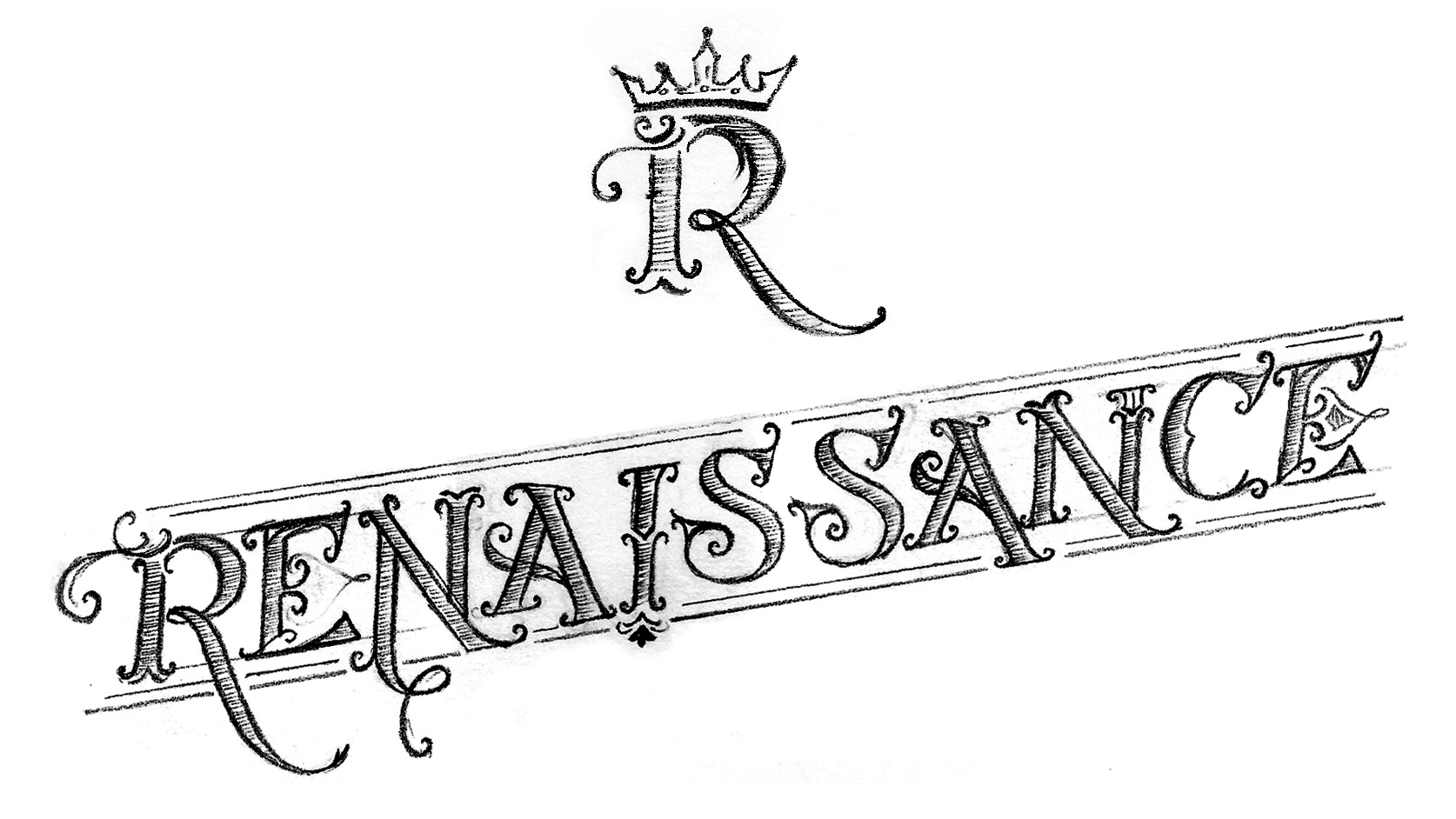
Concept 3
The third, and the chosen, concept was based on a typeface called “Rembrandt Series,” also from the ATF type specimen printed in 1899.