
Gold Coast Search Partners
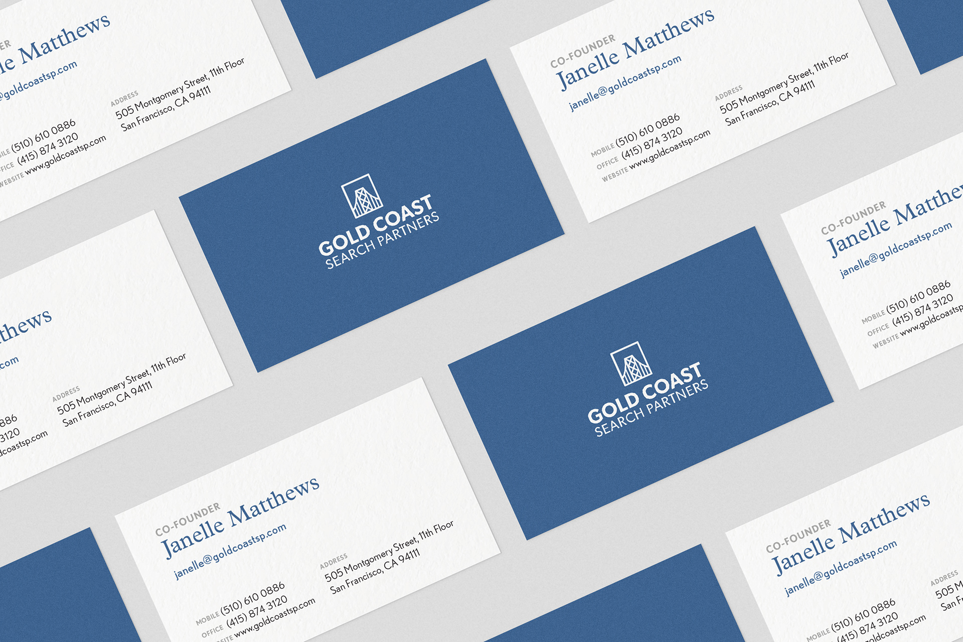
Gold Coast Search Partners is a recruiting firm for the financial services industry with offices in San Francisco and New York City. I was asked to design a logo, a website and business cards for their new company.
Logo Design, Website Design
The Goal
The client’s vision for the brand was that it be simple, modern, professional, detail-oriented, but overall understated. The purpose of the website was to be useful, to the point, clear and concise.
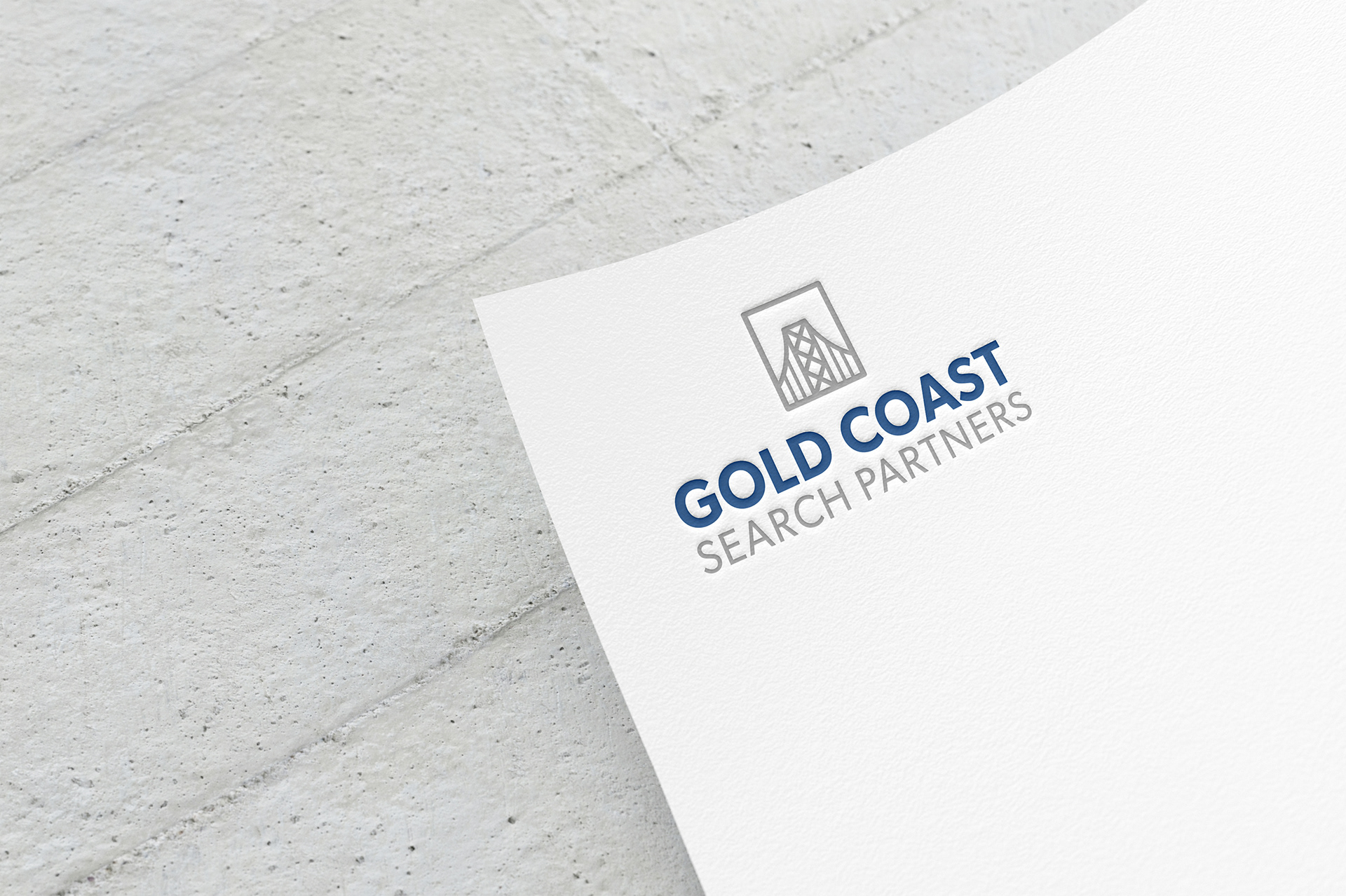
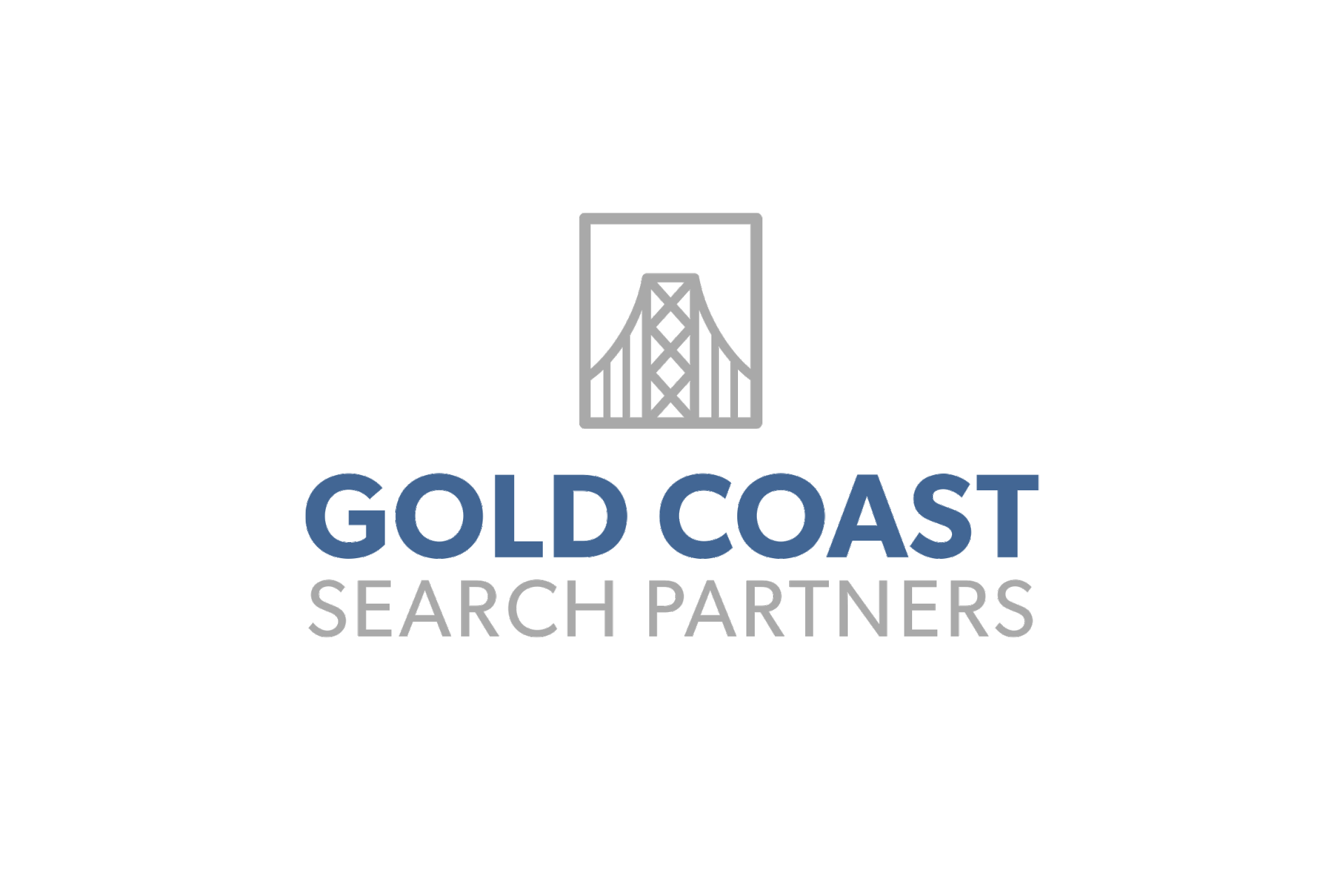
The Logo
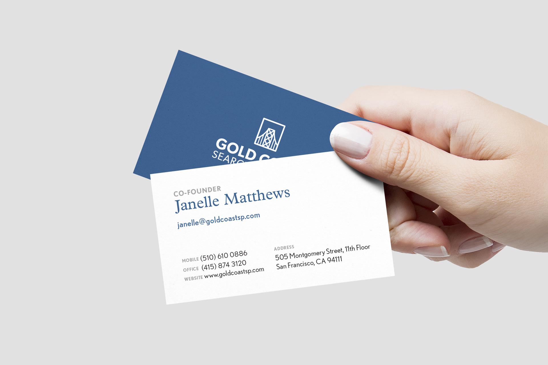
The logo is a simple rendition of the San Francisco–Oakland Bay Bridge, a nod towards the company’s place of origin. The company’s name is neatly aligned and typeset in Gibson for a clean, modern and tempered look.
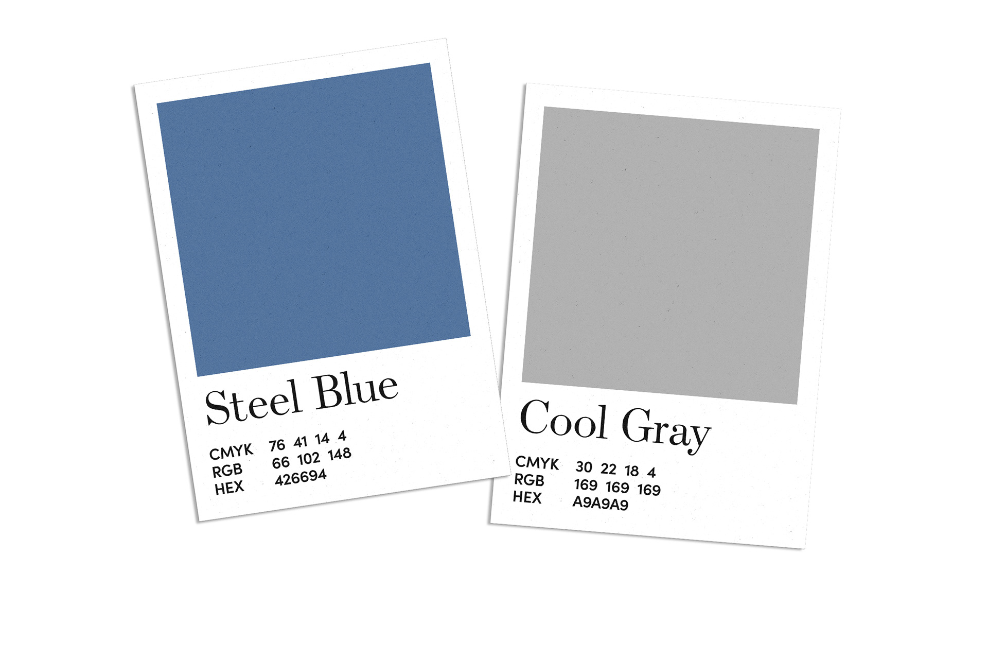
The Brand Colors
The client envisioned one of their brand colors to be steel blue. A cool gray was a natural pairing that felt aligned to their vision of the brand.
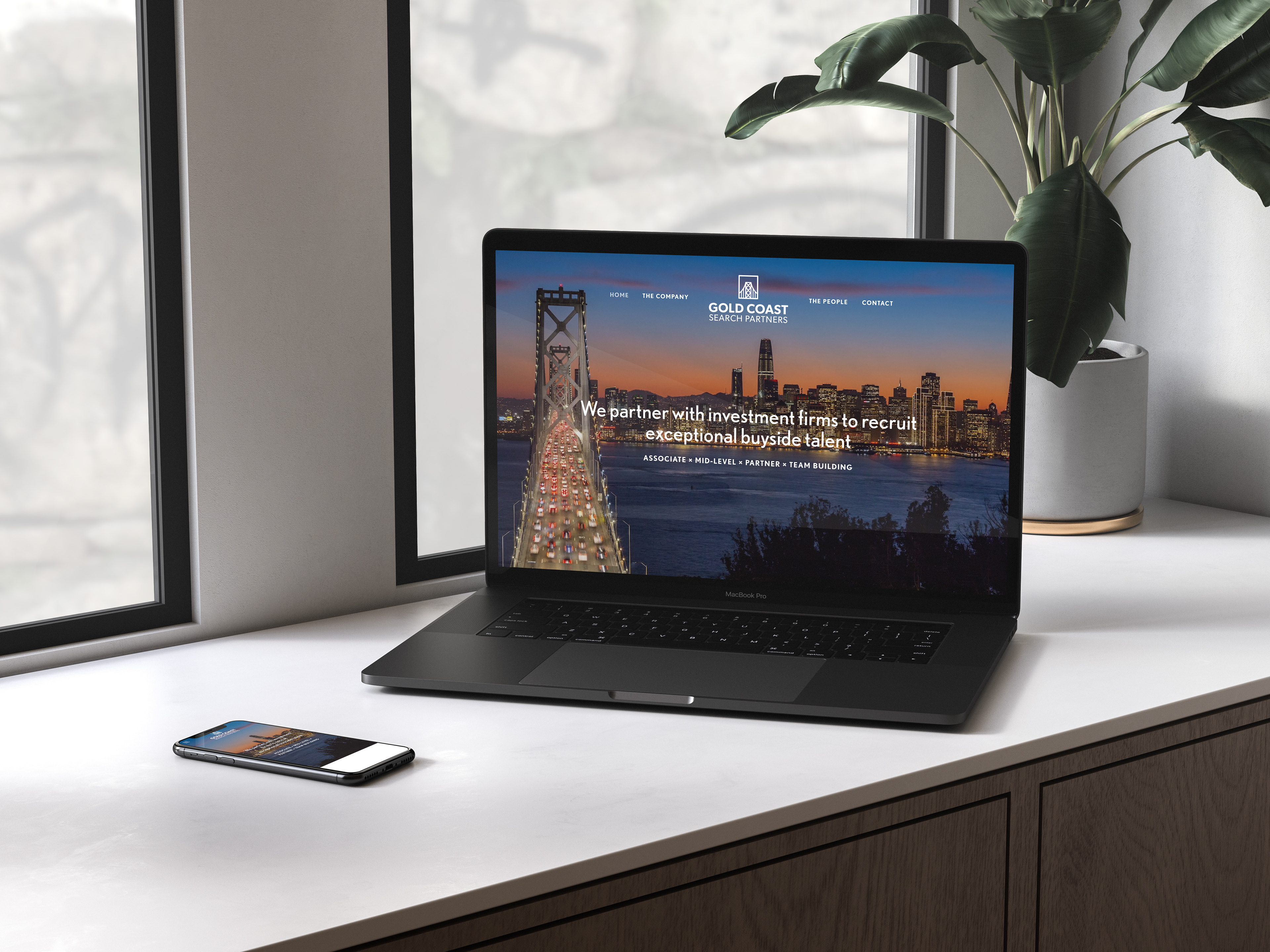
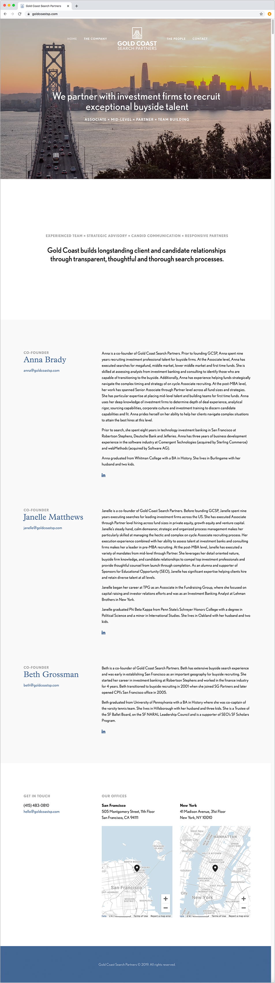
The Website
The two goals for the website design were:
1. It should portray that the business was founded on the West Coast, and more specifically, the San Francisco Bay Area.
2. It should look professional, simple, clear and concise.
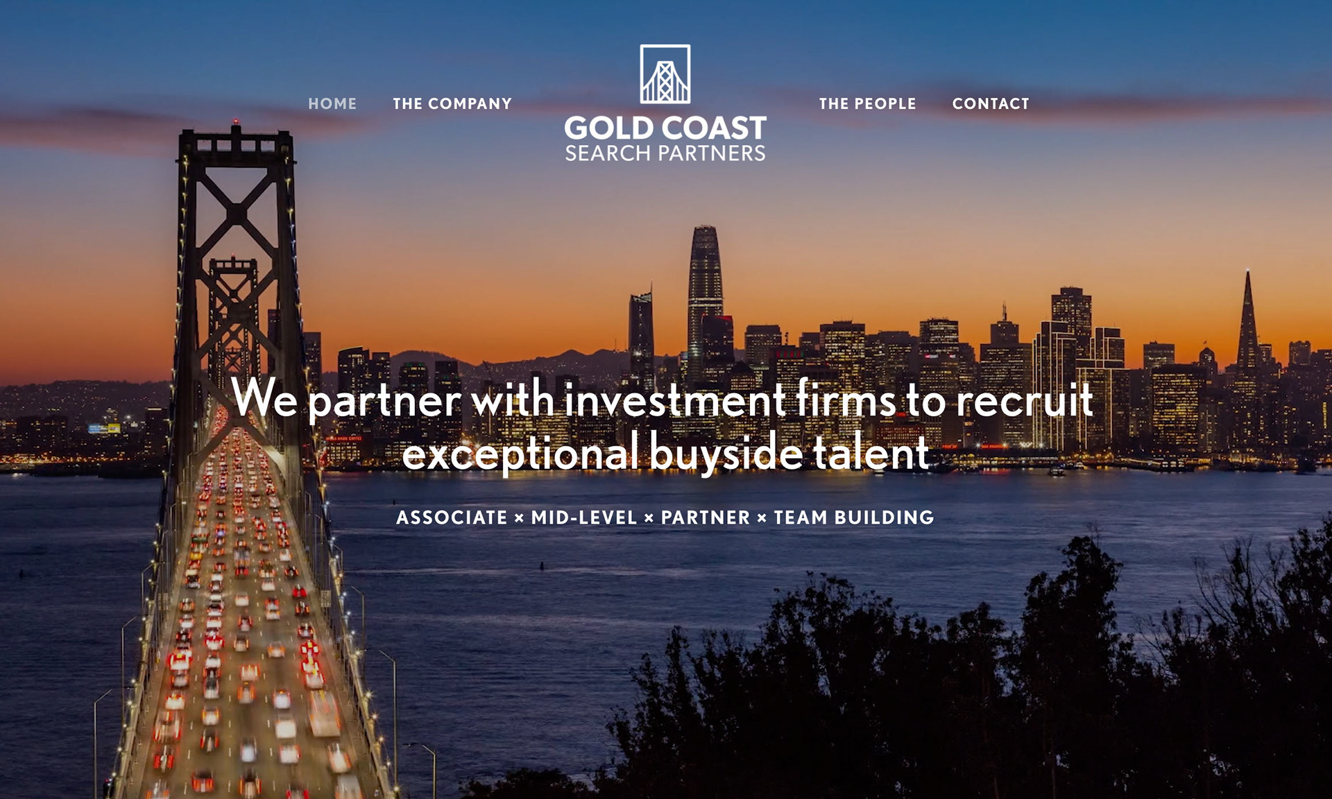
For the first goal, I chose to feature a time-lapse video of the San Francisco skyline with the SF-Oakland Bay Bridge. It tied in the company’s location with the bridge logo perfectly.
For the second goal, I chose to make a one-page website divided into sections and a fixed navigation with anchor links, as opposed to the initial three-page requirement.
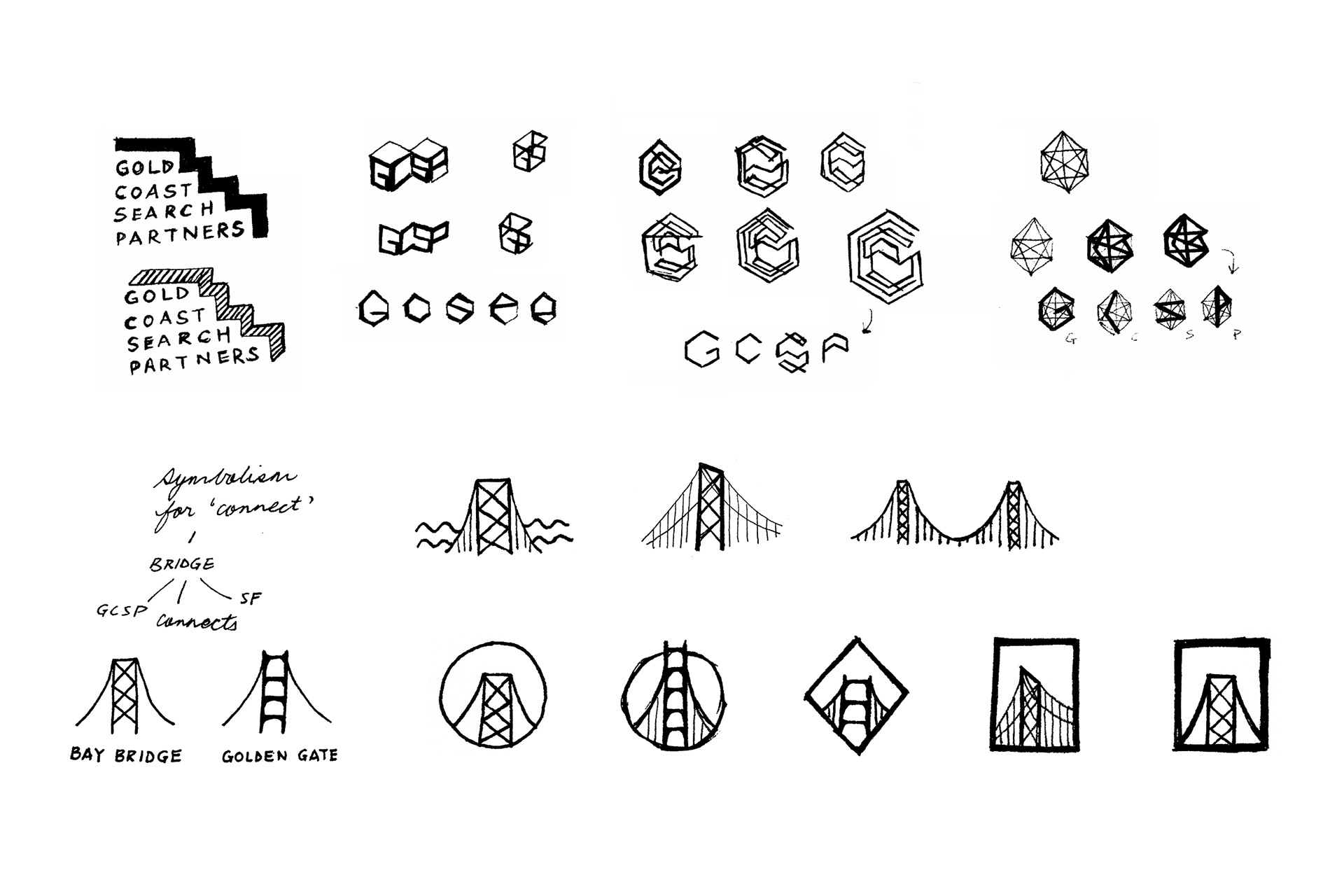
The Process
The idea of a bridge as the logo was most successful as connecting people is the essence of the company. The symbolism of the bridge as a connector and the existence of two iconic bridges in the SF Bay Area aligned perfectly with the brand narrative. The gray SF-Oakland Bay Bridge became a natural fit for the company’s logo.